Wellness App
Lactose - Out
Lactose-Out App
We created a dining out app for lactose intolerant people. Lactose out’s main value is to bring lactose intolerant people together and create a community where they feel safe in the dining out experience by sharing reviews about the restaurants visited. The mission was to find a solution on how this could be made possible on a digital platform.
ROLE
User research, user persona and user journey map, wireframes, user flow, design system, low-, mid-, and high fidelity prototype, usability and desirability test, UX writing, UI Design.
TEAM
M.Bethania Medina UX/ UI Design
Kenny Delgado UX Design
TOOLS
Figma, Google forms, usability hub
SPRINT
10 Days
BRIEF
As participants of The Daily Health Conference 2023, we were tasked with designing innovative native mobile apps that empower members to track and improve various aspects of their well-being. The apps should embody a fresh brand identity, reflecting an innovative approach to wellness, and provide a seamless user experience that fosters active participation and a strong sense of community.
GOALS
Create a Mobile Native App. The MVP should:
-Rethink how users could adapt & commit to a health improving routine
-Address and adapt any aspect of well being, offering a completely unique or improved experience in the saturated market.
-Allow users to monitor their progress & encourage them to adopt healthier lifestyles.
-Comply to GDPR guidelines (user control over personal data)
-Reflect a fresh and updated image aligned with the Daily Health Conference values.
Secondary research
Finding and understanding the niche
When we were presented with the brief we quickly made the decision to work in the niche of nutrition in relationship with a chronic condition. We noticed that for gluten intolerants or celiacs, there are many alternatives in the market, even though for Lactose intolerants too we decide to dig deeper into this area. We wanted to understand if and how having this condition could affect the social life of the people suffering from it.
Dr. Linda Dahl wrote:
“It has been estimated that 68% (65% Adults) of the world’s population can’t digest lactose. That’s two-thirds of all the people in the world. There are regional variations, of course.”
The information obtained in this secondary research and market research helped us to elaborate the survey questions that we distributed among different channels- Facebook groups, Instagram, Slack, and WhatsApp-.
Quantitative research
Getting to know the users
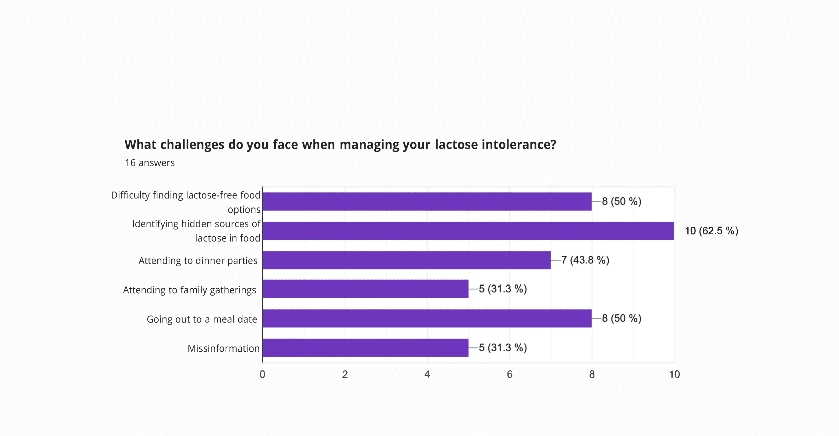
Since we choose a niche that it was difficult to access a broad database, after 2 days of pushing the Survey through different channels, we still didn’t manage to gather enough data -16 answers- from where we could learn more about the experience of lactose intolerants on a daily bases.
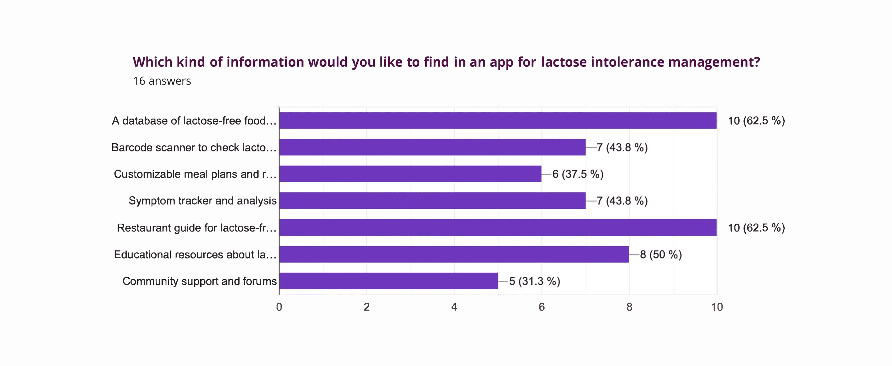
We analyzed our results to see the more distinctive patterns about what challenges lactose intolerants experience on a daily basis: The majority were Going out to a meal date (50%), Identifying hidden sources of lactose in food (62,5%), and Difficulty finding lactose-free food options (50%).
We noticed the main interest on an app for this matter was in A database of lactose-free food (62.5%), a Restaurant guide for lactose-free dining options (62.5%), and educational resources about Lactose intolerance (62.5%).
Market research
Where could we be on this market?
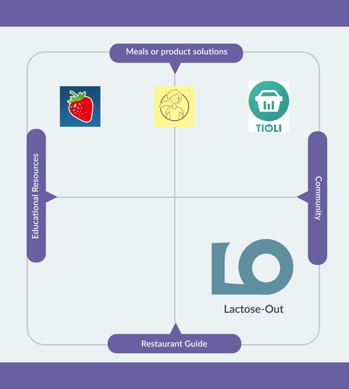
After looking for apps in the market that already presented these trends revealed by the survey. We found three which had these kinds of features: Ask Ingrid, Food Intolerances app, and Tioli. Comparing their features made us realise that there was a gap in the market for apps that present a feature for Restaurant guides for lactose-free dining options and Community support.
All the competitors have a high offer in meals and products which the people could prepare and eat at home, making our possible app Lactose-Out an important offering of what could be dine out.
Qualitative research
What the user wants and really needs
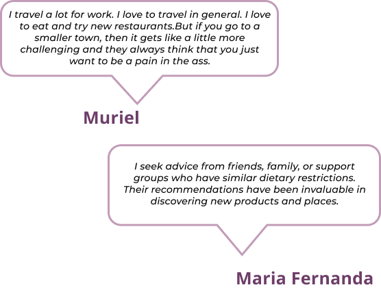
Since the results of the survey were not sufficient and we needed to dig even deeper into our qualitative research, we decided to use the Job-To-Be-Done approach to design our User Interview guide, the main goal of using this approach was to figure out which are the main challenges that lactose intolerant individuals or those with symptoms confront on a daily bases and how our product will help them to fulfil those needs and get the job done.
Target: Lactose intolerant individuals among 20-60 yrs old.
Interviews: 9 users
We organised the insights utilizing an Affinity Diagram to uncover shared themes within the collected data.
The clusters reveal a Supergroup: Information containing two Sub-Groups: Access to accurate information and Awareness from condition Restaurants and service industry. And another main group is Community.
As a first step to empathise with our users we formulated the
JTBD Statements.
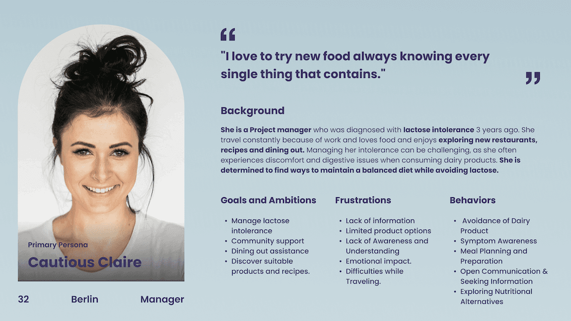
User Persona
Knowing and empathising with our primary user
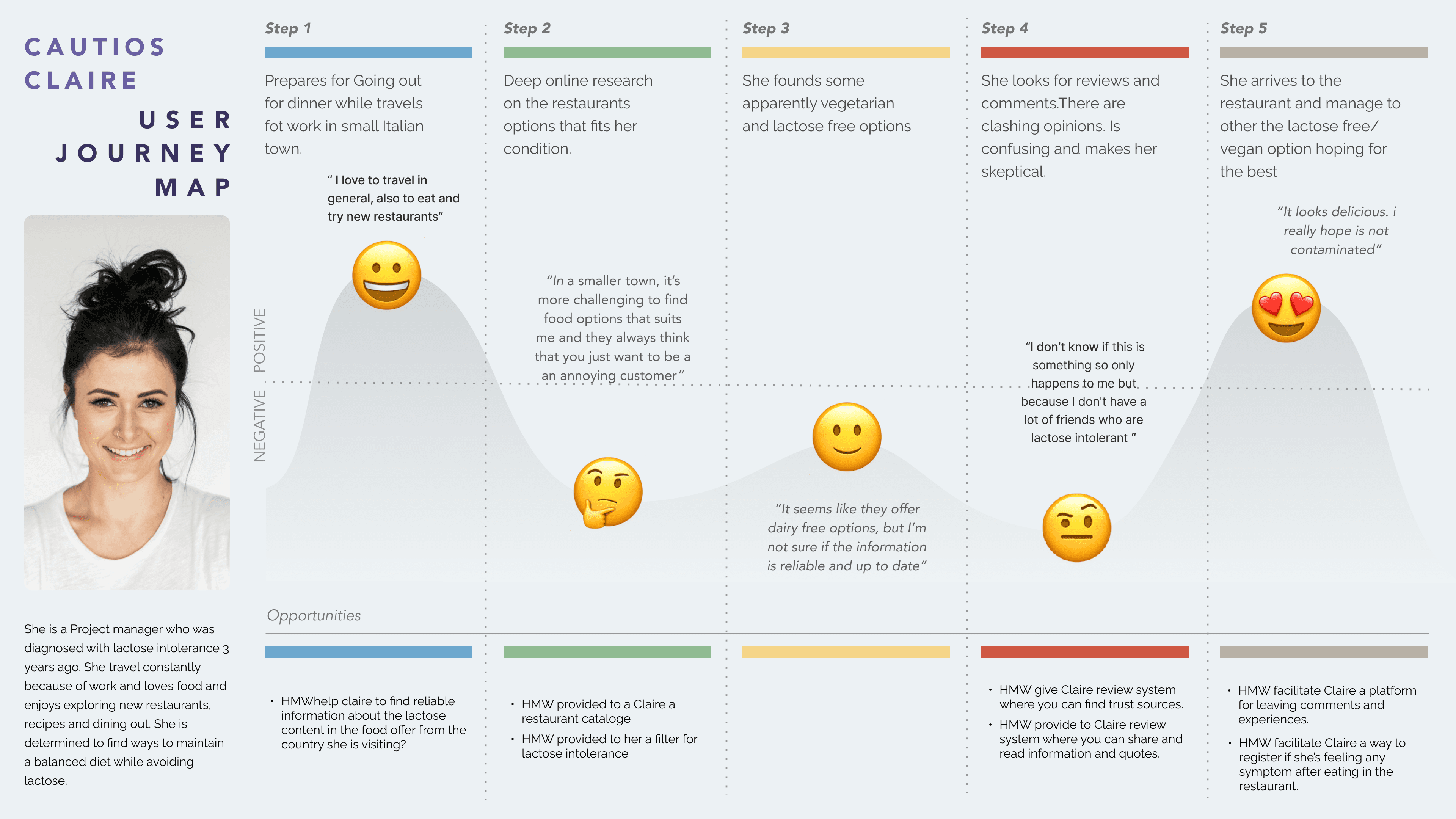
User Journey Map
Identifying Claire's main pain points
Design Opportunities
How Might We Help Claire
How Might We facilitate Claire a way to register if she’s feeling any symptom after eating in the restaurant.
How Might We give Claire a review system where she can find trusted sources.
How Might We provide Claire with a restaurant catalogue?
Poblem Statement
“People with lactose intolerance need to find a way to discover trustworthy restaurants because they experience digestive problems which last more than one day preventing them to enjoy and performs their daily tasks. ”
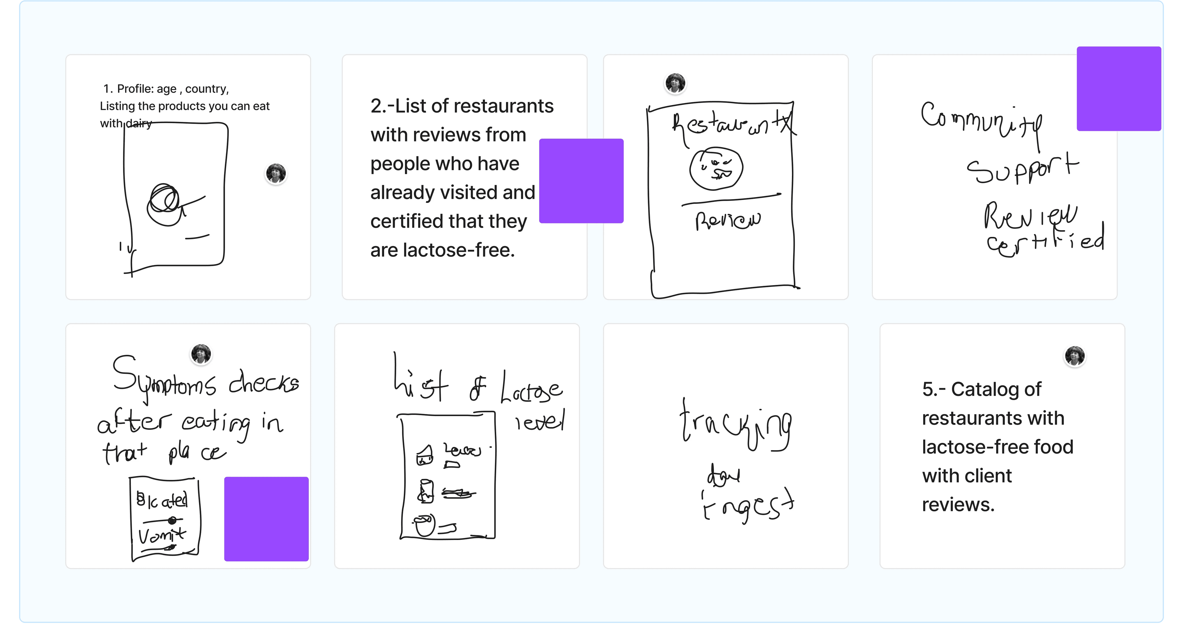
Ideation
The Crazy 8's to help Claire
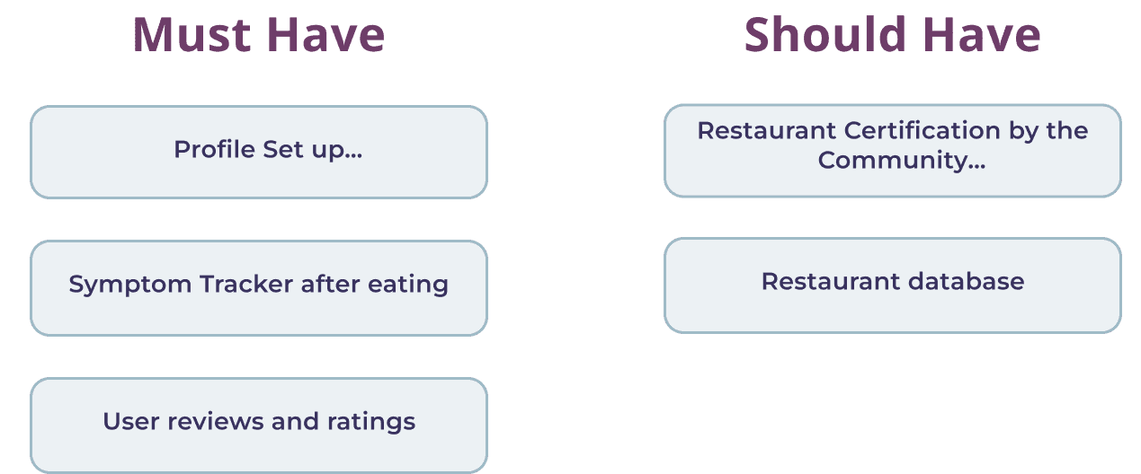
MoSCoW Method
The Must and Should have features
MVP Statement
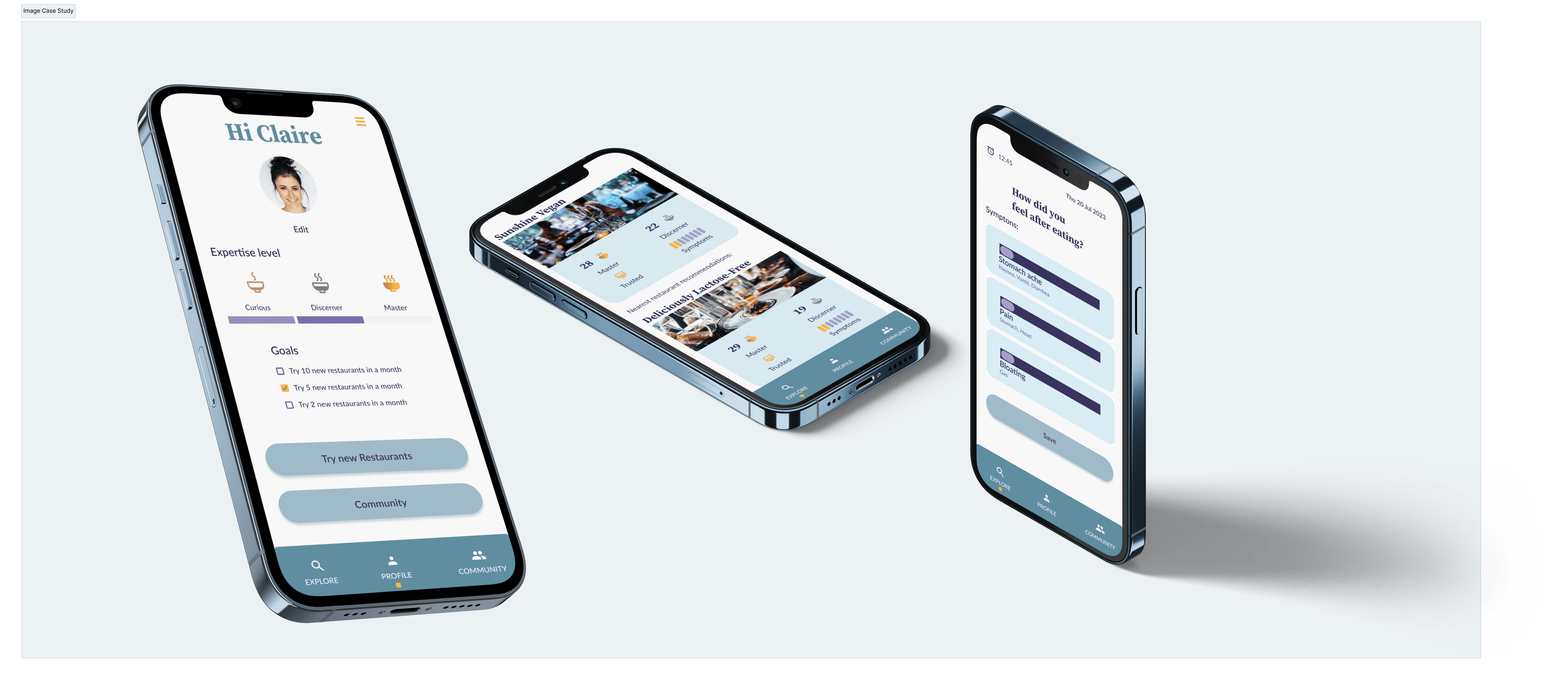
“At the bare minimum the goal of the Lactose-out app is to offer the user a lactose-free dining platform connecting them with certified restaurants by the lactose intolerant community, a personalised profile related to their intolerance levels, and a symptom tracker for an enjoyable eating-out experience without digestive concerns.By providing this information the user will feel safe and confident when assisting to the chosen restaurant”
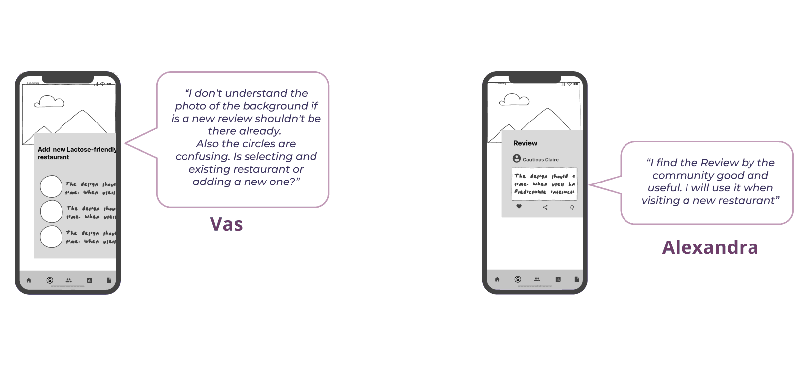
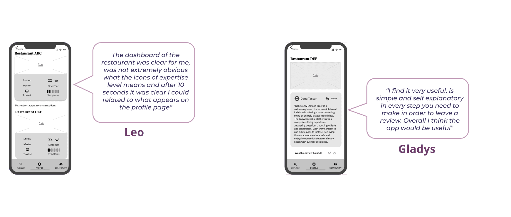
Lo-Fi Wireframes
Testing the concept with 5 users
Mid-Fi Wireframes
Testing the usability with 5 users
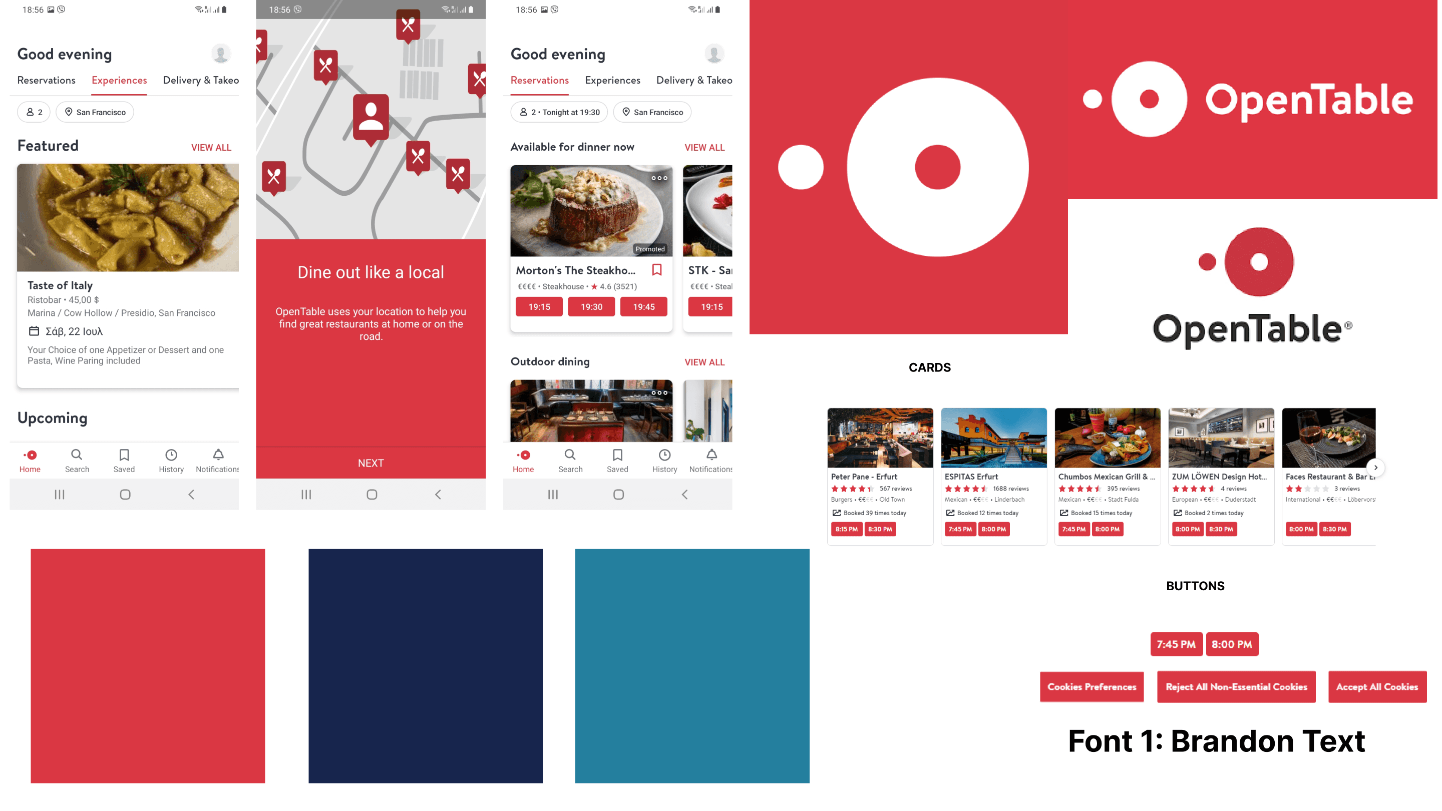
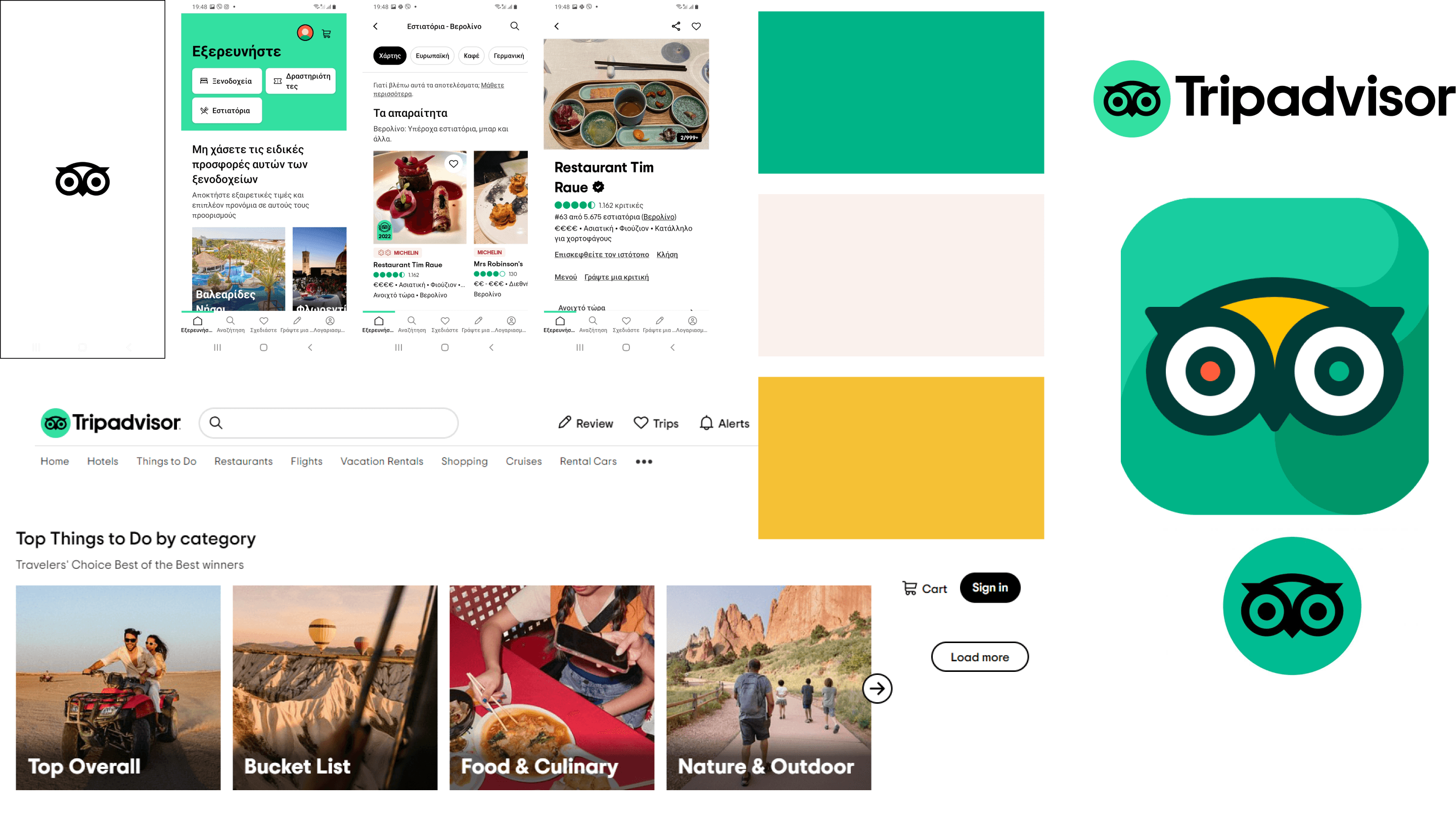
Visual Competitor Analysis
Almost there Claire. Now comes the look and feel
In order to move on from Mid-Fi to Hi- Fi we run a VCA choosing three apps that present a similar format of recommendations and restaurant reviews, such as: The Fork, Open Table, and Trip Advisor. So the user could be benefit somehow from a similar mental map.
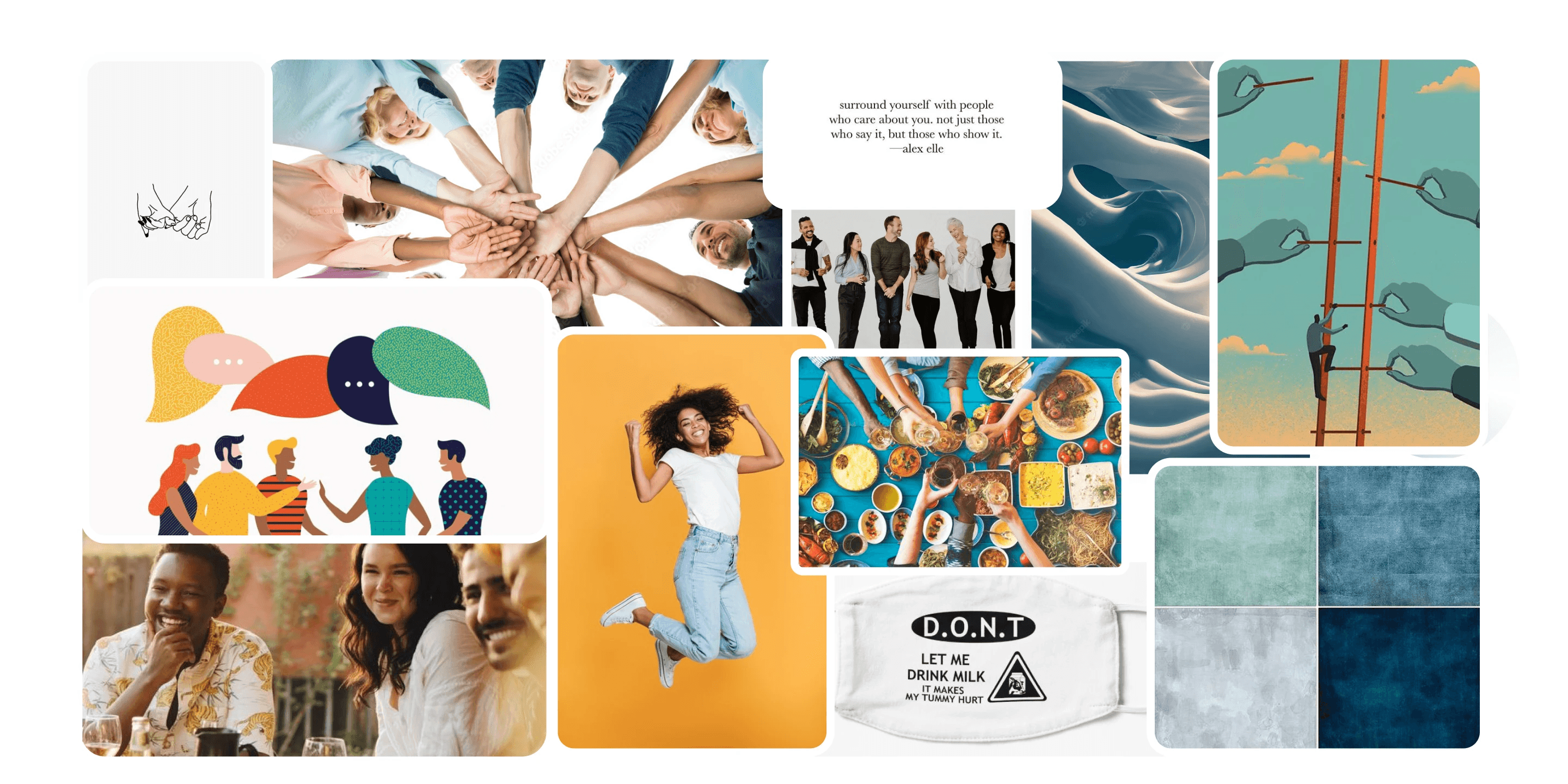
Moodboard and Style Tile
Building the brand in the way to the Hi-Fi prototype
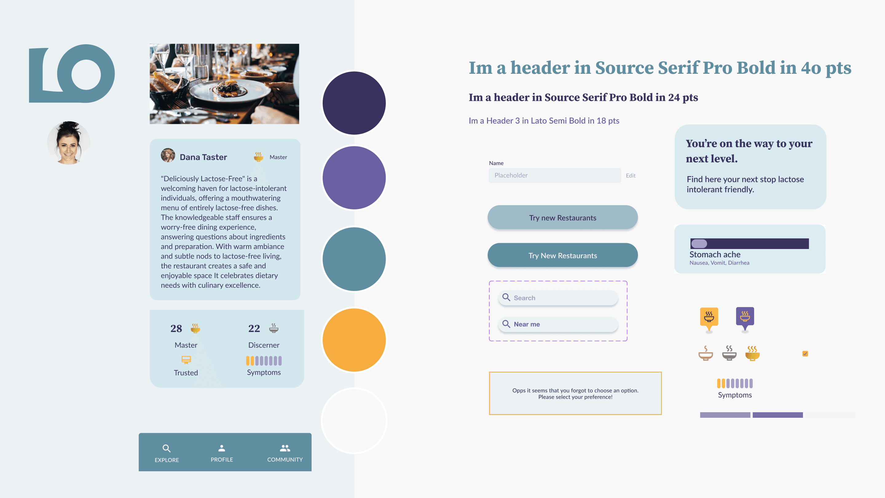
As we were moving on to build the Hi-Fi prototype we needed to define the brand attributes, we brainstormed and choose the ones that coincide more with some words mention during the usability test by the users, and then choosing the following ones: Trustful, Cheerful, Supportive and Communal. And then a succesfully tested moodboard was created.
As we were moving on to build the Hi-Fi prototype we needed to define the brand attributes, we brainstormed and choose the ones that coincide more with some words mention during the usability test by the users, and then choosing the following ones: Trustful, Cheerful, Supportive and Communal. And then a succesfully tested moodboard was created.
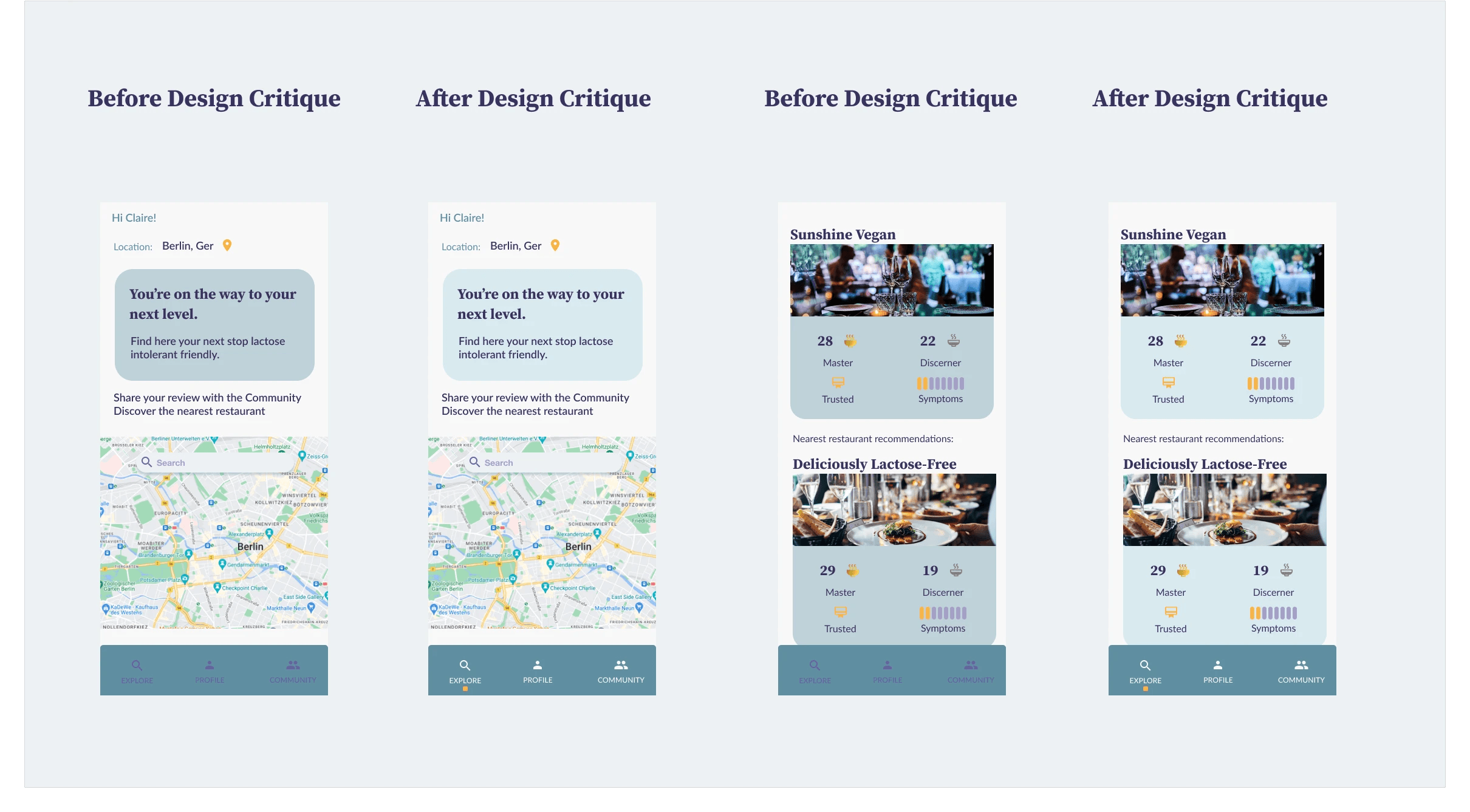
Hi-Fi Iteration and Desirability testing
Getting the brand on point
We conducted the 5-second test using the “app.usabilityhub.com.” We uploaded images of our diferent Hi-FI wireframes and asked the testers to select at least five adjectives from a list of ten that came to their mind after viewing them for 5 seconds, and the results prove that even though two of the brand attributes was not chosen with more than 50%, but a synonym as Helpful from Trustful and Enjoyable from Cheerful, we were still in the right path, but informed us that in next iterations we should try to aim even closer to our original brand attributes.
Hi-Fi Prototype
Let's join Claire at her first Lactose-out experience
Next Steps
and Take Aways
We prioritized developing the essential feature for our app. However, we managed to generate a few additional ideas that could be considered for future iterations:
Reward System: goal Achievements and Community Contributions.
Add features showing the community interaction.
Improved UI Design: high Contrast Colors,to make it more accessible.
Run more accesibility tests.
The significance of communication and empathy with our teammates cannot be overstated.
Effective time management is crucial, especially when dealing with tight deadlines.
Embracing the opportunity to learn new software or skills, even amidst challenges, opens doors for personal and professional growth.
The iterative process of testing and refining is essential to ensure a successful outcome.
A resilient attitude helps us stay focused and productive.
