Local E-Commerce
Bereket Cafe
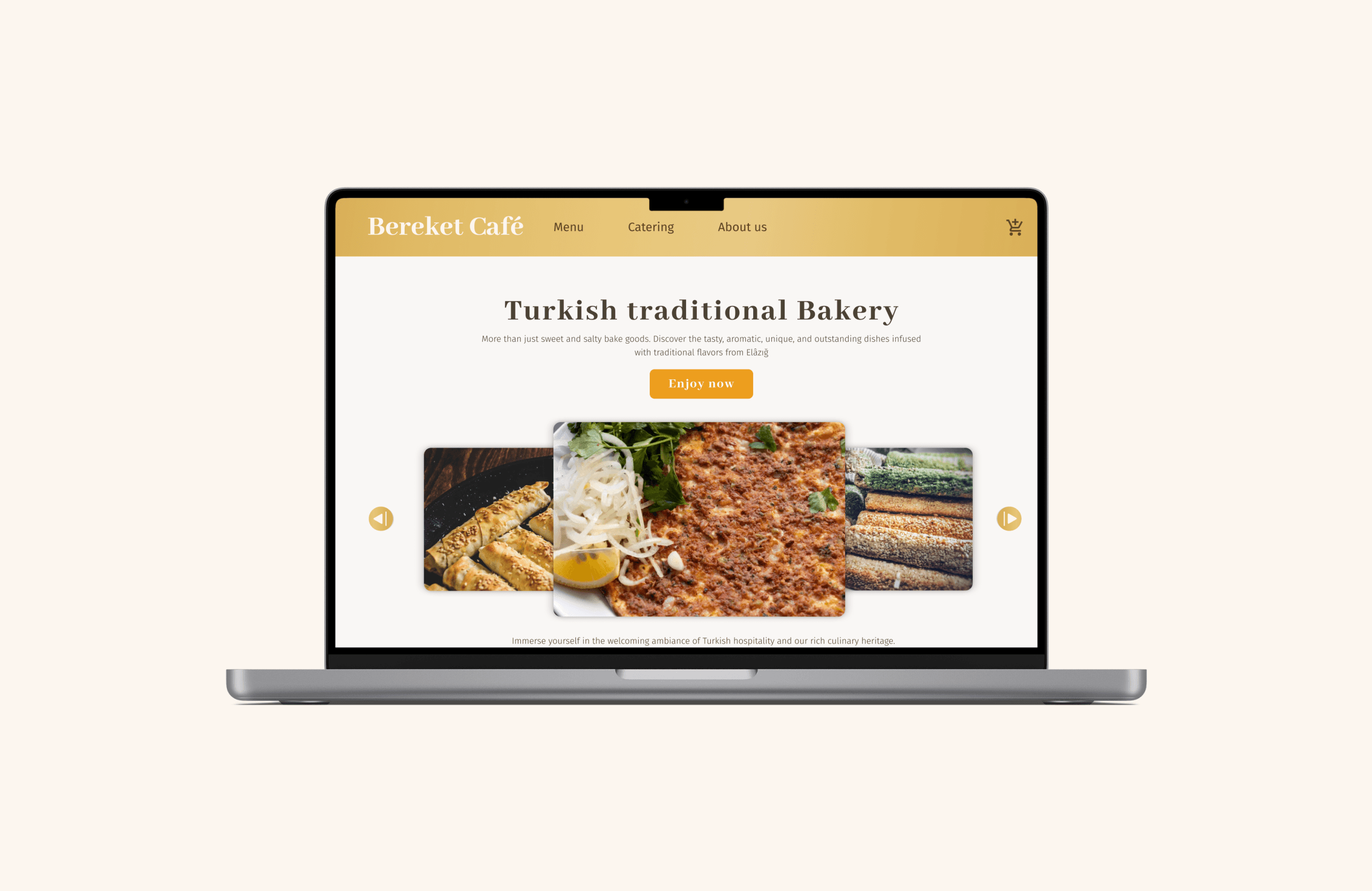
Bereket Café Website
We created a website with branding strategy for la turkish tradional bakery, a family local business. Bereket Café Website’s main value is to give the possibility of usual customers place bulk orders for their events as well as attract new customers by showcasing the menu with detailed description and photos .
ROLE
Market research, User research, user persona and user journey map, wireframes, site map, user flow, design system, low-, mid-, and high fidelity prototype, usability and desirability test, UX writing, UI Design.
TEAM
M.Bethania Medina UX/ UI Design
Kirsten Schuman UX/ UI Design
Aaron x UX/ UI Design
TOOLS
Figma, Google forms, usability hub
SPRINT
10 Days
BRIEF
The creation of a website (E-Commerce) for our client “Bereket Stehcafe Kiosk & Backstube”. The website should display the menu of the cafe and offer various ordering options.
GOALS
Create a Website E-Commerce. The MVP should: Create their online presence to increase their visibility both online and offline, while delivering a great online shopping experience for the business’ end users.
Secondary research
Understanding the stakeholder
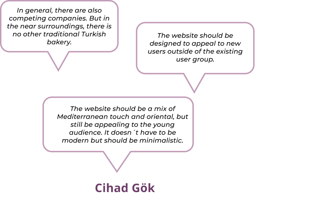
Our contact person was Cihad Gök, a 26-year-old manager, who together with his family are the owners of a small café and bakery situated in an industrial area near Bohn, close to a Mosque.
We gathered very limited information which we could find online about Bereket Stehcafé and possible competitors, and then proceed to create our interview guide. During the session, we gathered a multitude of invaluable insights, but we particularly focused on the ones shown here.
Market research
Where are we in this Market?
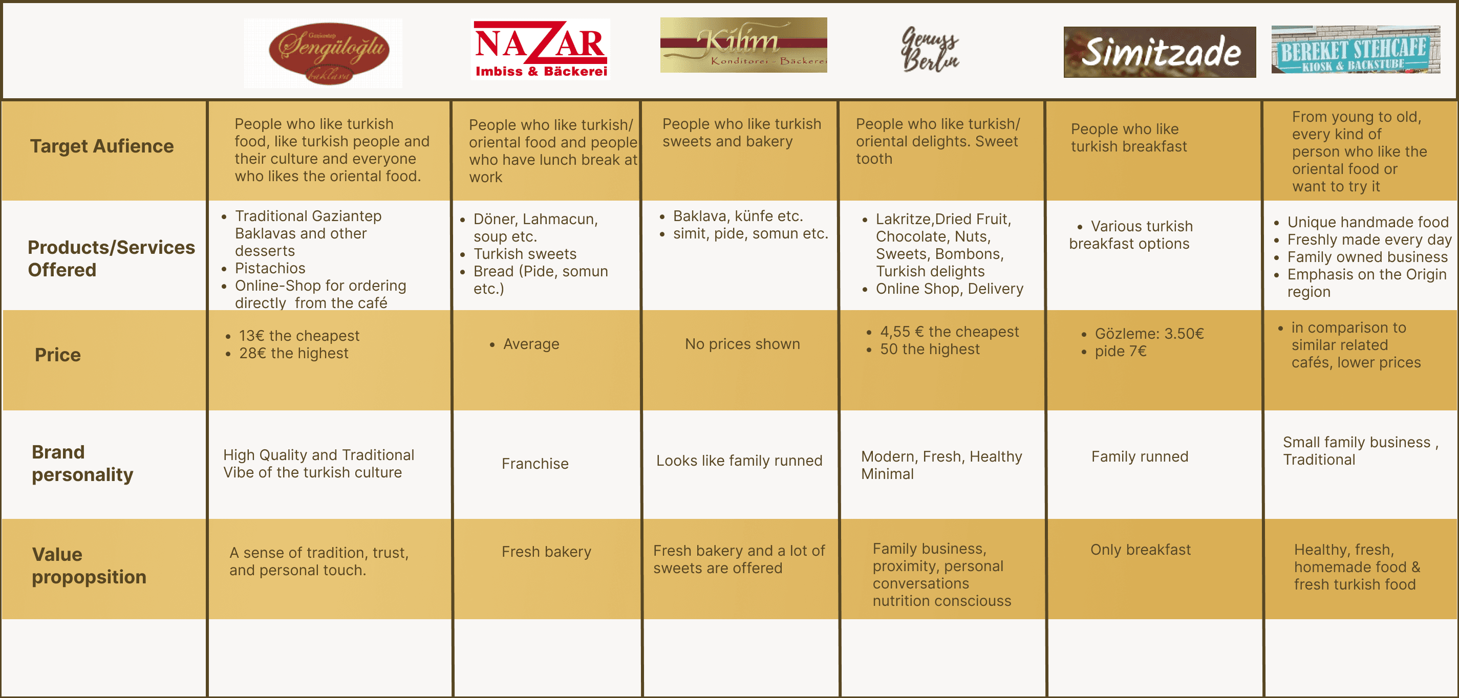
First we did a Brand Comparison Chart, unfortunately did not yield valuable information, indicating that we should consider utilizing a different method to get deeper insights.
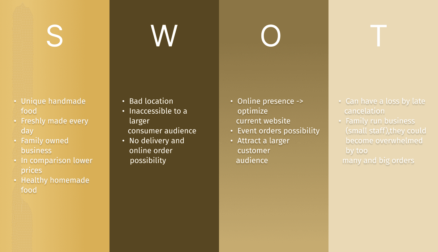
SWOT Analysis
Where could we be in this market?
Through the SWOT Analysis, it became evident that a combination of our identified weaknesses and the opportunities we discovered could prove advantageous:
Event orders possibility.
No delivery and online order possibility.
Attract a larger customer audience.
These findings provide us with the opportunity to delve deeper into user research and design an interview guide that aligns with this direction.
Qualitative research
What the user wants and really needs
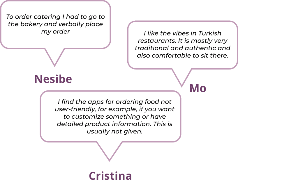
The goal of conducting user research (UXR) interviews is to gain insights into whether the interviewees have ever placed bulk orders before and, if so, what their experiences were like. Additionally, we aim to understand how they envision the ordering process and what features or elements they would like to see incorporated.
Target: Participants interest in food and online ordering. 20-45 yrs old.
Interviews: 6 users
We organised the insights on an Affinity Diagram to uncover shared themes within the collected data.
This process unfolded smoothly, and upon analyzing our results a clear Supergroup with groups revealed:
Turkish food order options:
-Turkish food delivery
-Catering from bakery
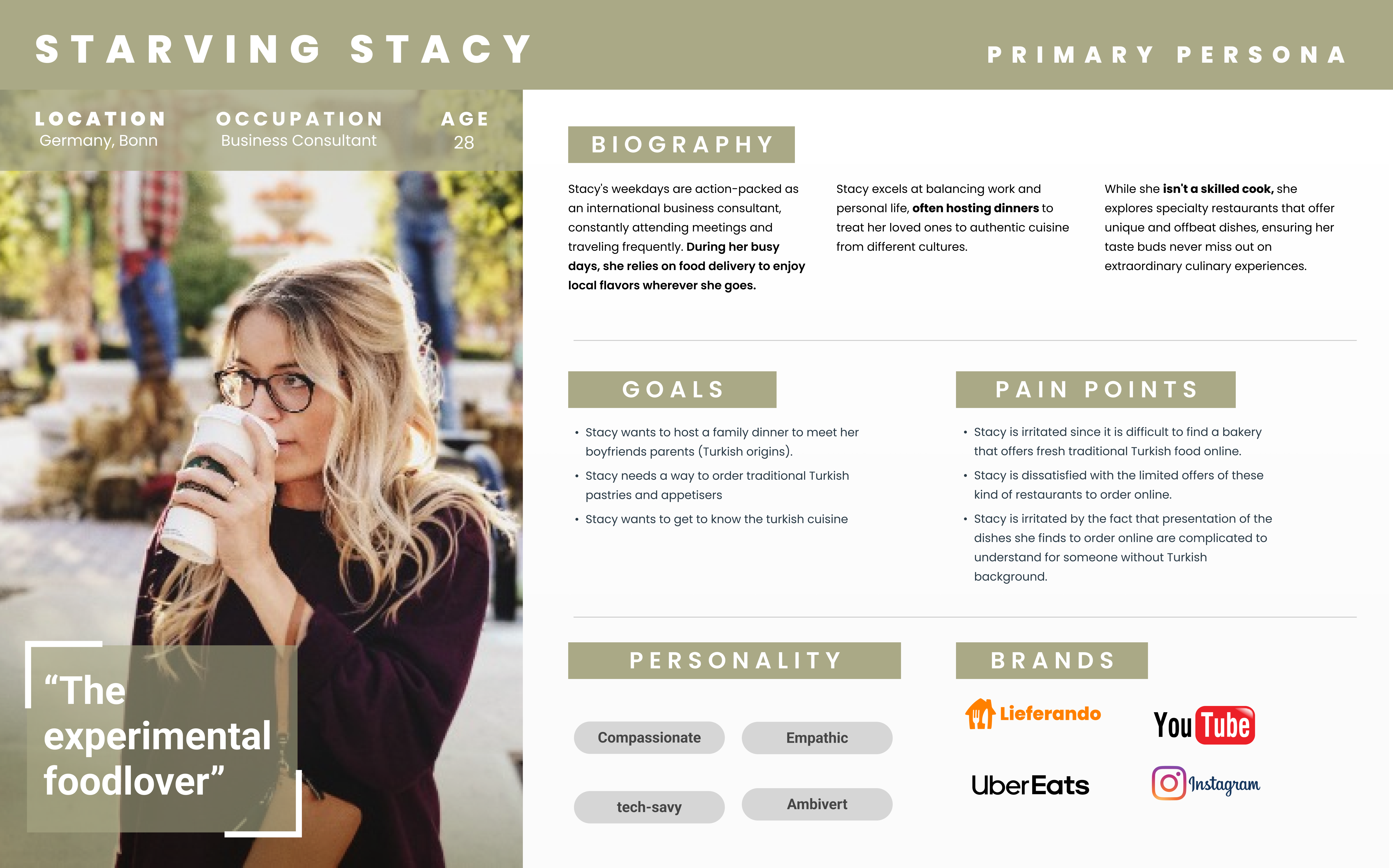
User Persona
Knowing and empathising with our primary user
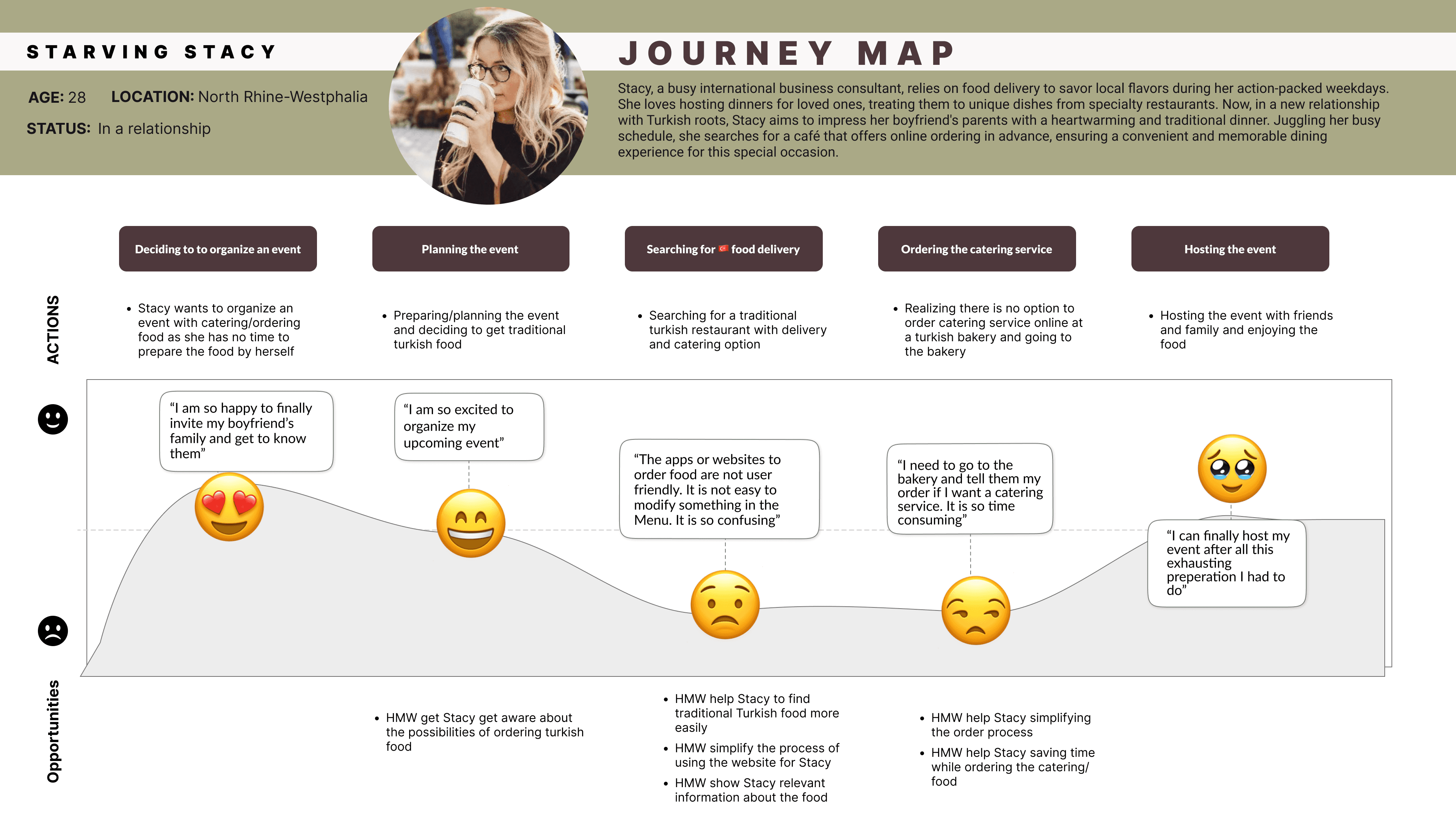
User Journey Map
Identifying Stacy's main pain points
Design Opportunities
How Might We Help Stacy
How Might We show Stacy relevant information about the food.
How Might We help Stacy simplify the order process.
How Might We help Stacy save time while ordering the catering.
Poblem Statement
“People interested in traditional Turkish food need to find a way to detect and order the desired food online because the current ordering process in person is time-consuming and the users have difficulties finding the needed information about the food and placing their orders online. ”
Ideation
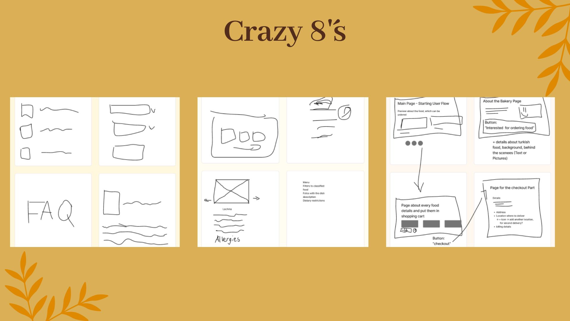
The Crazy 8's to help Stacy
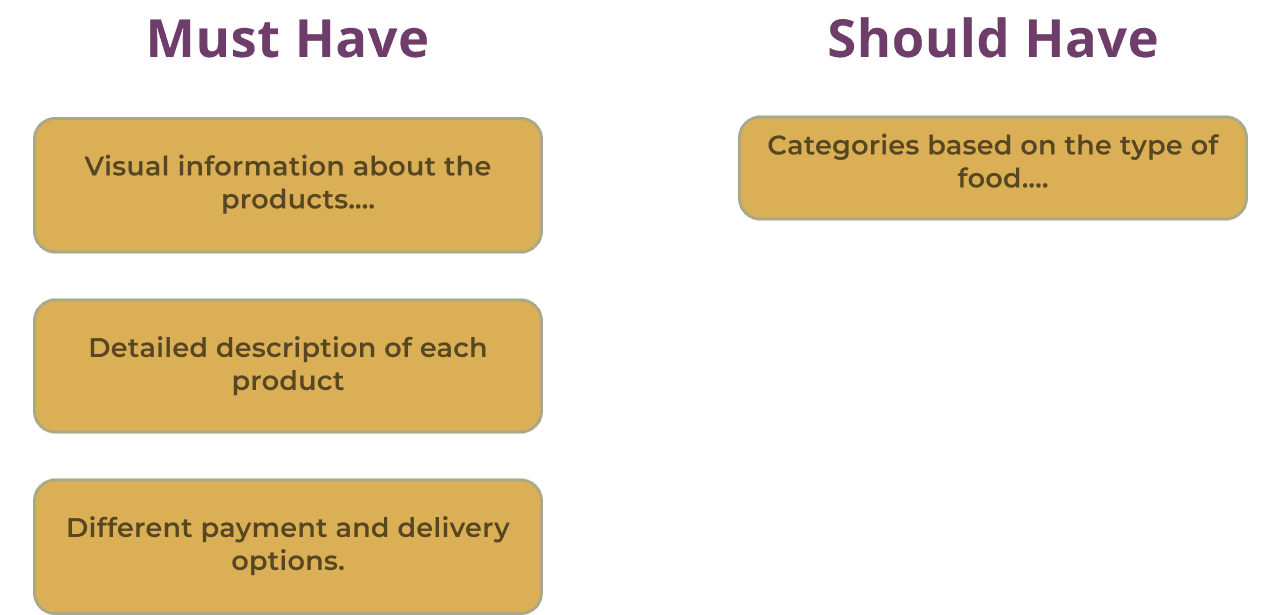
MoSCoW Method
The Must and Should have features
MVP Statement
“At the bare minimum, the goal of the website for Bereket Stehcafe Kiosk and Bakery is to improve the customers’ experience when ordering online by providing relevant and visual information about the products, as well as various payment and delivery options.”
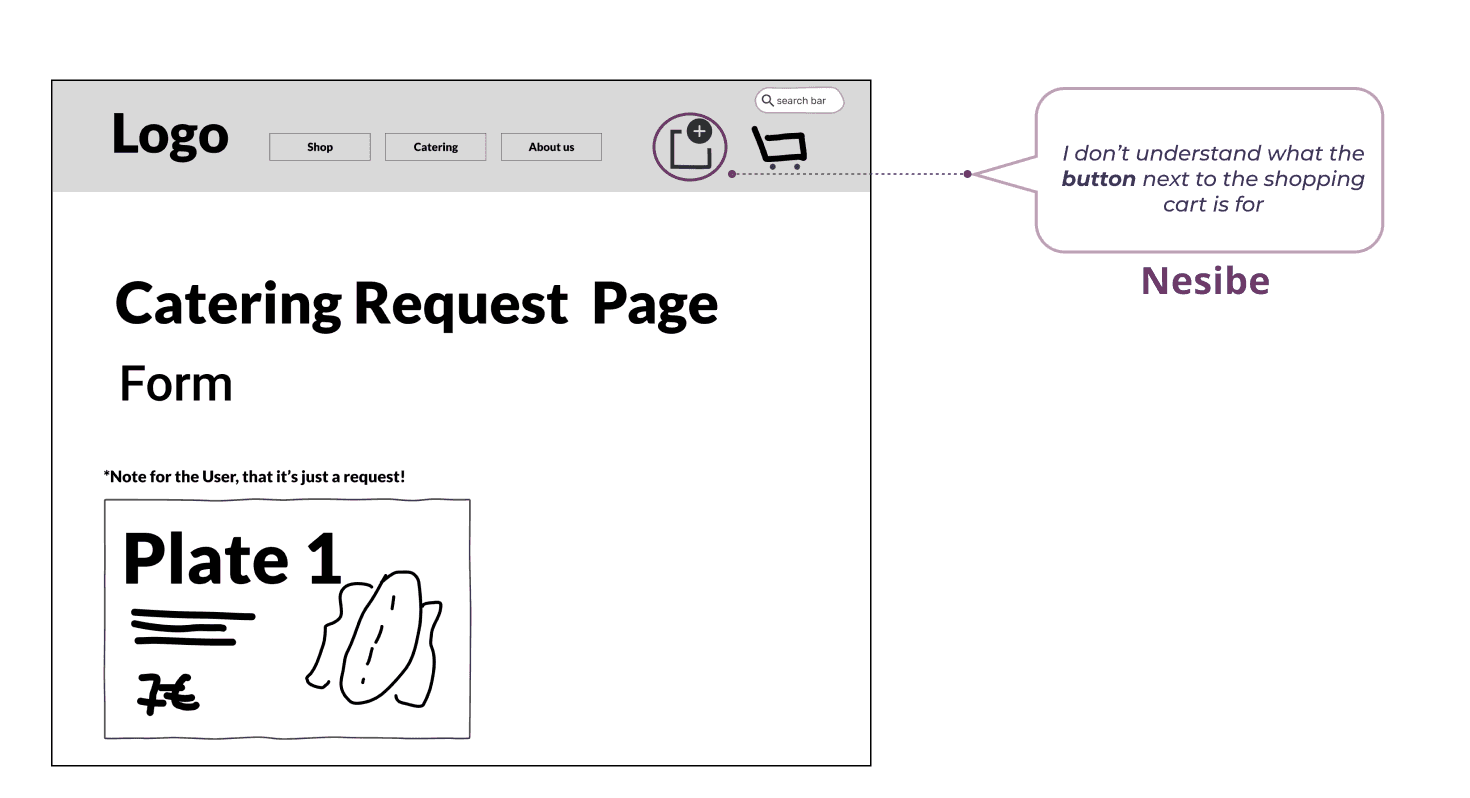
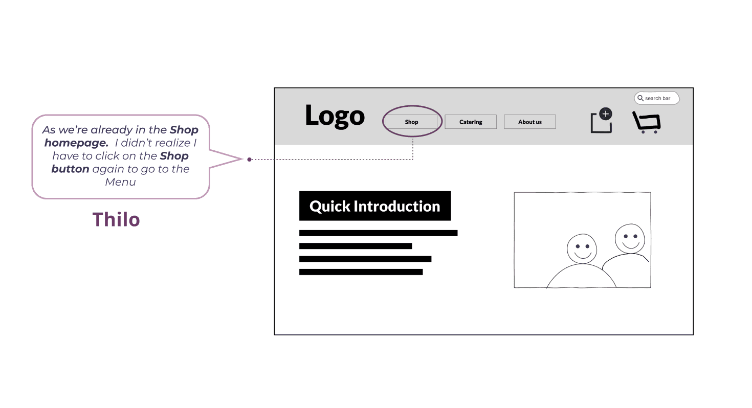
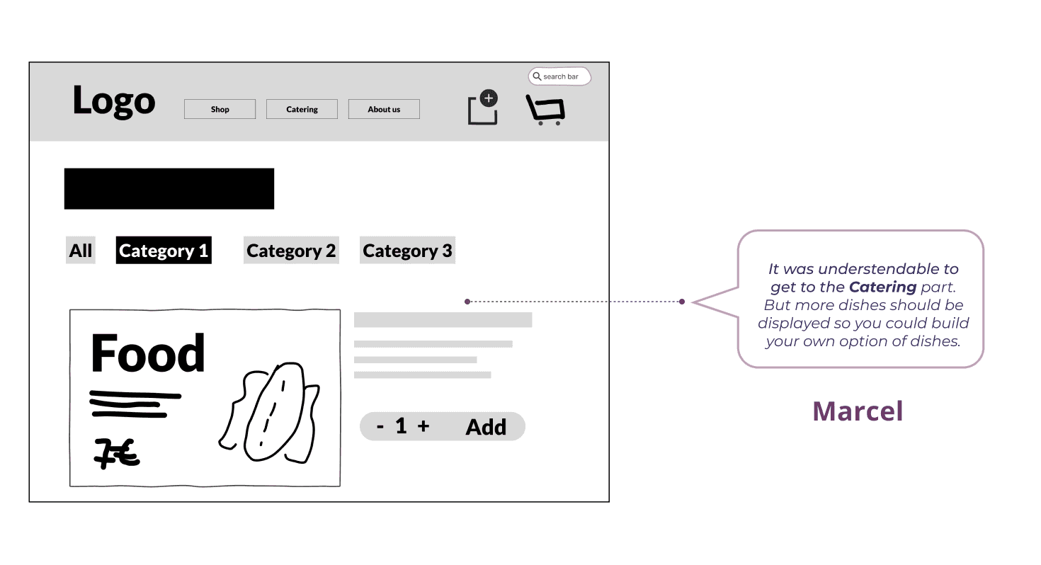
Lo-Fi Wireframes
Testing the concept with 5 users
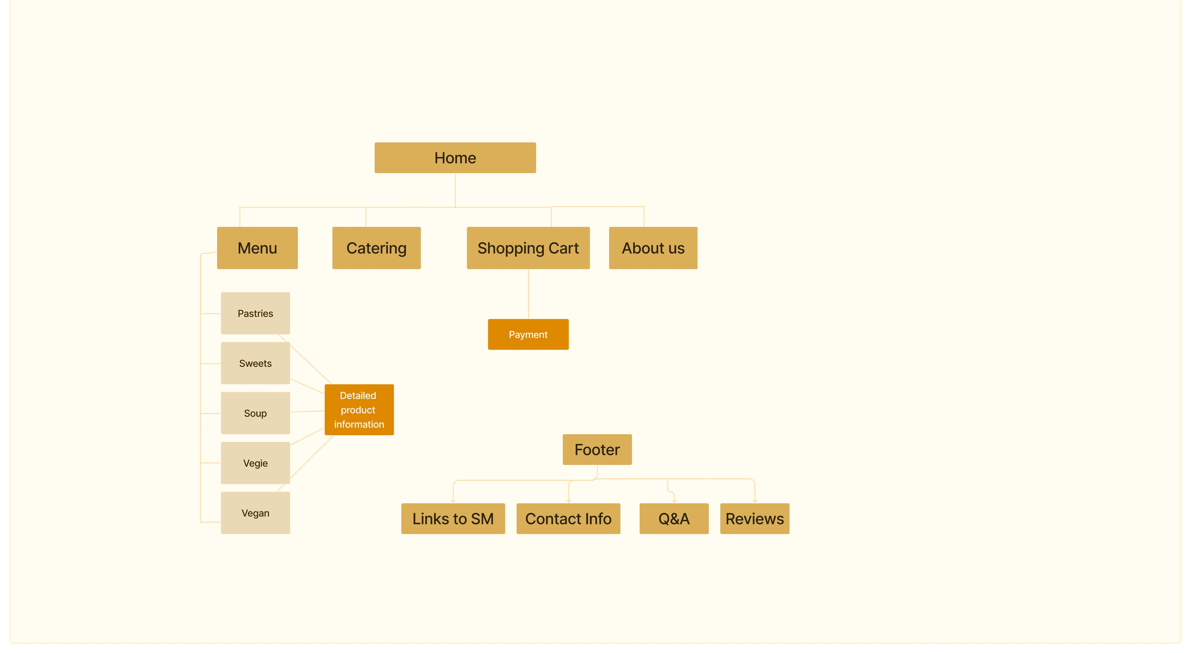
Sitemap
What and how Stacy's will find on Bereket's website
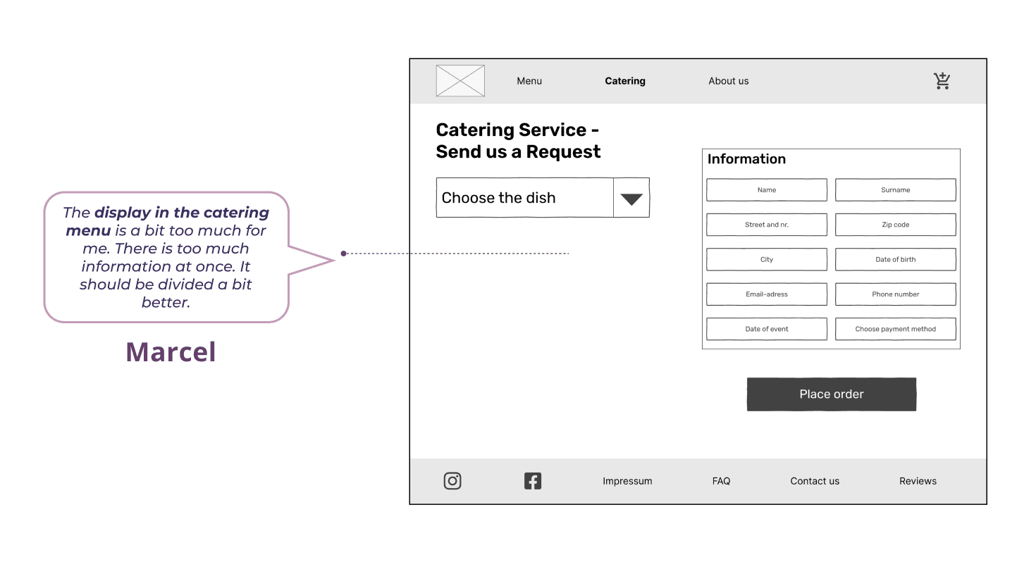
Armed with the information on what needed to be modified in our upcoming Mid-Fi prototype, we swiftly delved into creating a proposal for the Site Map.This would help us to organize the information and give some hierarchy, before we adjust the changes from the Lo-Fi wireframes and create what was missing to add in the Mid-Fi wireframes
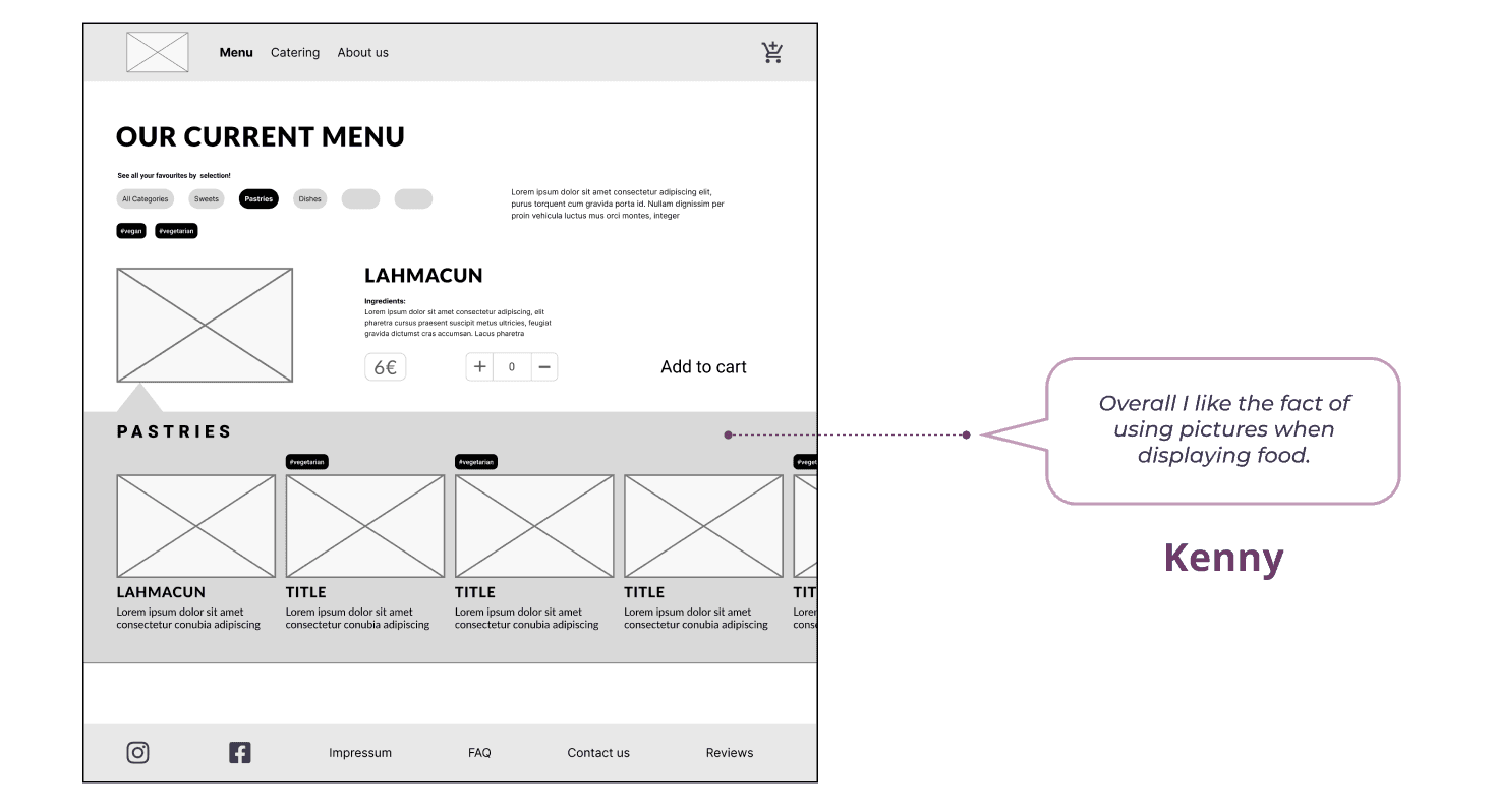
Mid-Fi Wireframes
Testing the usability with 5 users
We engaged five users who were between the ages of 25 and 45, and who frequently order food online. We used a mix of the Think Aloud Protocol and Retrospective Probing.
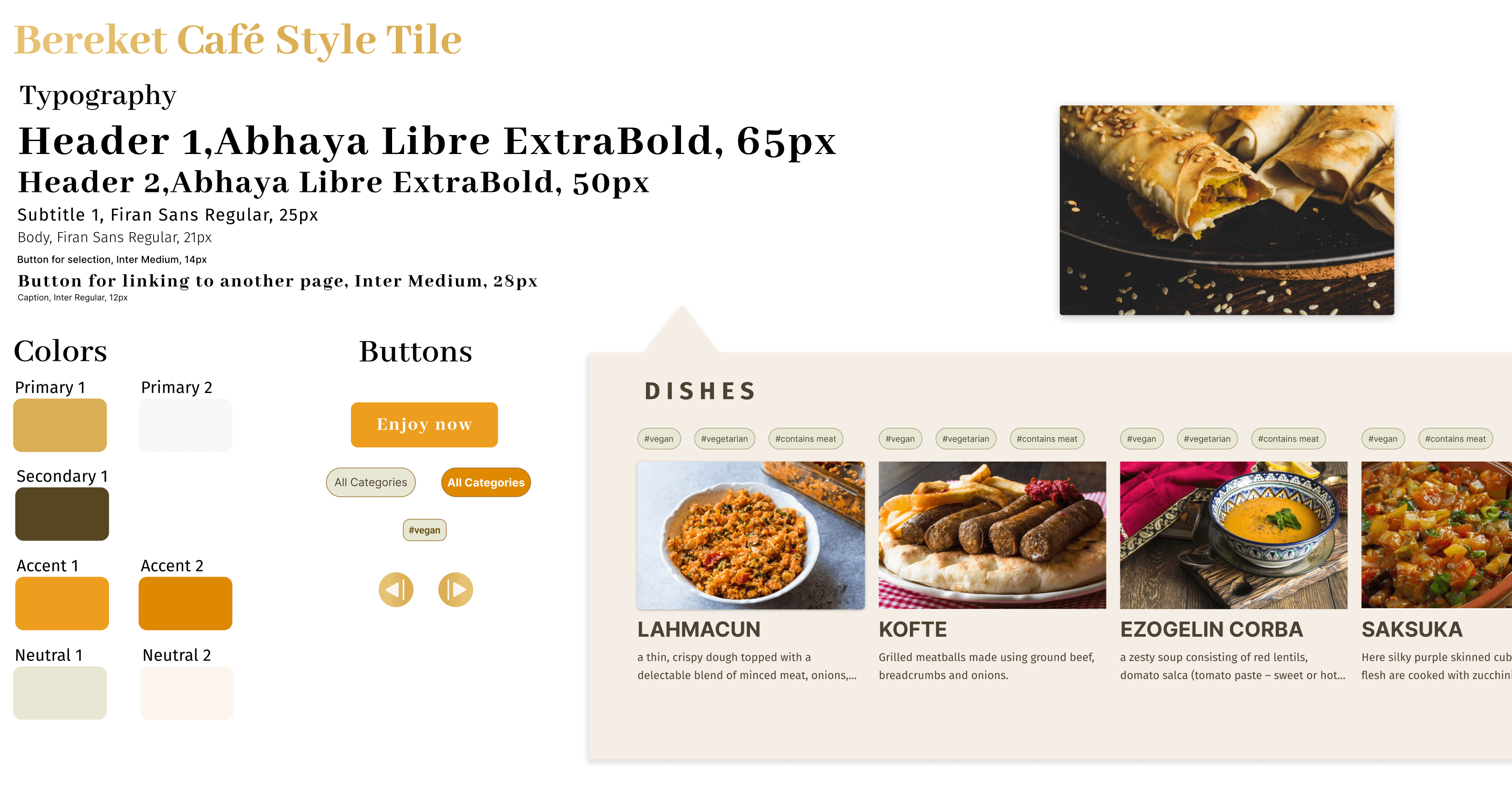
Moodboard and Style Tile
Building the brand in the way to the Hi-Fi prototype
To select our “Brand Attributes,” we employed a collaborative approach. We set a timer for 7 minutes. After the time was up, we proceeded to vote on the attributes to choose the top 5 that best represented our brand: Traditional, warm, authentic, passionate, fresh. We compiled images to create the moodboard and tested it, the feedback went relatively well for us as we successfully hit almost all the marks, except for “Passionate”. From the beginning we all felt uncertain about this particular attribute because it didn’t clearly convey what we were seeking in that sense, so we decided to remove it.
Creating the brand identity and style tile based on the confirmed attributes happened organically, we choose warm colors in between brown, gold and orange shades to communicate tradition and warmth. The typefaces prompt a combination of a traditional -serif- and modern. We start testing colors and typefaces on the Mid-Fi wireframes and after the design critique and a few adjustments, we had one that we could started transitionated to the UI phase.
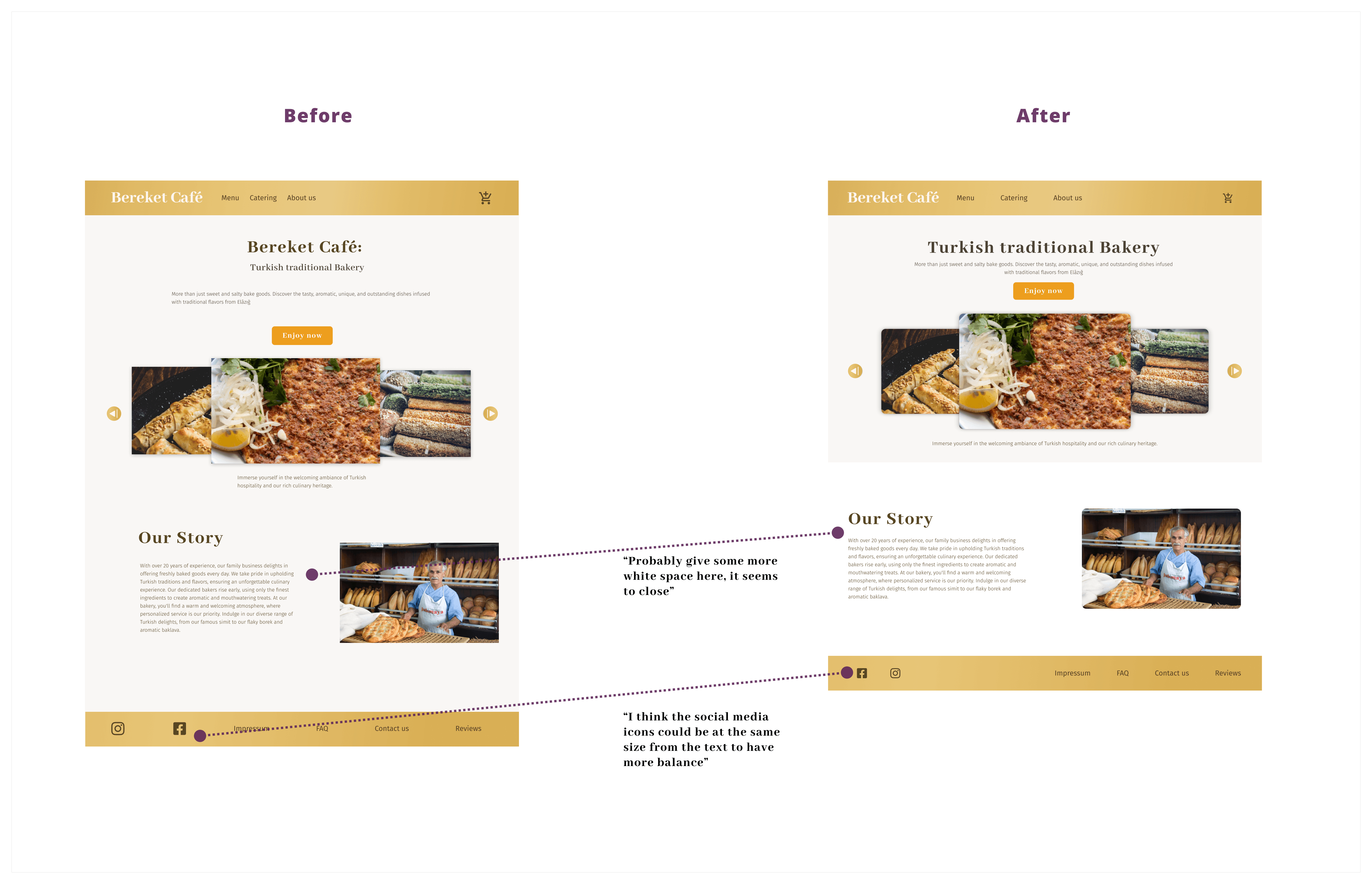
Hi-Fi Iteration and Desirability testing
Getting the brand on point
The Design Critique helped us to recognized the need for adjustments in terms of spacing and the selection of a consistent characteristic for our UI elements, particularly buttons. After appliying this adjustments we conducted the 5-second test using the “app.usabilityhub.com.” We uploaded images of our diferent Hi-FI wireframes and asked the 14 testers to select at least five adjectives from a list of ten that came to their mind after viewing them for 5 seconds, and the results prove that even though one of the brand attributes -Authentic- was not chosen by over 50% of the testers, the other three of them -Warm, Traditional, and Fresh- performed well.
Hi-Fi Prototype
Let's join Stacy ordering at Bereket's online
Next Steps
and Take Aways
We prioritized developing the MVP for the website. However, we managed to generate a few additional ideas that could be considered for future iterations:
Add a Recommended Menu section for the Catering order.
Add the possibility of creating a User Profile, for frequent users.
Refine the UI patterns
And from the whole project working with recently acquainted teammates provided me with invaluable lessons:Communication and empathy with our teammates are key.
Prioritizing tasks and optimizing efficiency becomes even more important in such situations.
Test, Iterate, Test, again and again.
Adapting to unexpected challenges and maintaining a positive mindset is key
